(GNOME with vertical panel on right side and in red color)
You may find many articles on the net guiding you to install Dash To Dock extension on GNOME. But there are very few ones to speak more about experimenting with it. This article explores the features of this one Extension to show you possibilities it can give to your GNOME 3 desktop environment. You can enable click to raise/minimize window, change the icon size, color the dock or make it transparent, make the dock to mimic Unity Launcher, reposition it to any edge of your screen, etc. You will find my experiments below, like, make everything looks larger to help friends with vision impairments, using GNOME 3.32 desktop on GNU/Linux. Finally, happy tweaking!
Subscribe to UbuntuBuzz Telegram Channel to get article updates directly.
Read more about GNOME 3.32: Dash to Panel | Tray Icons | Useful Extensions | WTDAI | 3.32 on Dingo Beta| Ubuntu's Yaru | Distros Availability | Mojave Custom | Extensions Install and Remove
Where is it?
Distro coming with Dash to Dock preinstalled is Ubuntu up to this moment. But other distros using GNOME still can install it by going to E.G.O. website. The version I use in this tutorial is 66.
Once installed, in the Tweak Tool, you will find it under Extensions section. This Extension is one among few which has Settings available.Click the Gear ('*') button to show its settings dialog.
Once you have it, you can follow my exploration below. I will fill Part 1 to 5 with the 5 pages of Dash to Dock (DTD from now on) settings dialog.
Part I: Position and Size
The first part of DTD settings gives you control over everything about panel position and size. You enable autohide here, make it full size, and enlarge the icons. If you wonder what kind of setting latest Ubuntu interface has, it's actually Panel mode here enabled.
- Show the dock on: Primary Monitor|Other Monitor
- Position on screen: Left|Bottom|Top|Right
- Intelligen autohide(*): ON|OFF
- Dock size limit: 0%-100%
- Panel mode: YES|NO
- Icon size limit: 16|24|32|48|64|96|128
- Fixed icon size: scroll to reveal other icons: YES|NO
On Dock size limit measure, it's enabled by default if you don't enable Panel mode option, number you set there will be the length of the dock. If the number of apps running is more than dock length, you will need to scroll down to reveal other apps.
On Fixed icon size option, if enabled, panel size will adapt to number of apps running to avoid scrolling. It's not comfortable if you use the dock as panel as your maximized window will also adapt its size to dock size.
(*) Intellihide:
- Autohide: ON|OFF
- Enable in fullscreen mode: YES|NO
- Push to show: YES|NO
- Dodge windows: ON|OFF
- All windows, Only focused, only maximized: Select one
- Animation duration (s): 0.2
- Hide timeout (s): 0.2
- Show timeout (s): 0.25
- Pressure treshold: 100
Animation duration option may make animation smoother if you give it a higher number (max 1.0 s). Pressure threshold may help you if you wish hidden panel harder to show, 300 or 350 is a good number.
Part II: Launchers
The second part gives you control over the taskbar or list of apps running + pinned ones there. Notable option is Move the applications button... where if enabled it moves the start menu button from bottom to top of vertical panel. It's the actual setting of latest Ubuntu interface.
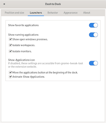
- Show favorite applications: ON|OFF
- Show running applications: ON|OFF
- Show open windows previews: YES|NO
- Isolate workspaces: YES|NO
- Isolate monitors: YES|NO
- Show Applications icon: ON|OFF
- Move the applications button at the beginning of the dock: YES|NO
- Animate show applications: YES|NO
Show open windows previews option will give you tooltip preview from right-click of an app on the dock. Disable it then no preview will show.
Isolate workspaces and monitors option will distinguish taskbar for different workspaces and different monitors. For example, if you run Firefox on workspace 1, then you move to workspace 2, taskbar will not indicate Firefox running on workspace 2. If you click the icon on workspace 2, it will run new window instead, not bring you to workspace 1.
Animate show applications option may help (a lot) reduce your computer resource if disabled. It may speed up your job as you need no animation anymore.
Part III: Behavior
Third part gives you control about click behavior of apps running on the dock. For those who consider clicking an app to show/hide the app window is the right thing, this is what they need. You want click to minimize, right? Then simply choose Click action: Minimize here.
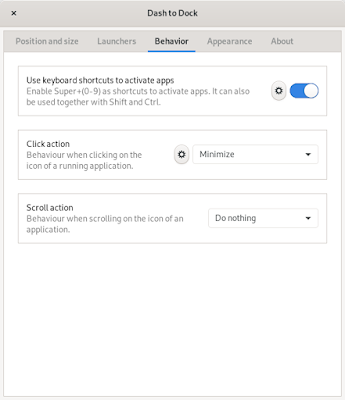
- Use keyboard shortcuts to activate app:(*) ON|OFF
- Click action(*): Raise window|Minimize|Launch new instance|Cycle through windows|Minimize or overview|Show window previews|Minimize or show previews|Focus or show previews
- Scroll action: Do nothing|Cycle through windows|Switch workspace
First option here turns normal vertical dock to Unity Launcher panel. When you hold Super key and press 1, first icon on the dock will run, just like we experienced on Ubuntu 16.04. The only difference at the moment is that it does not show the numbers immediately, we need to add number key (run an app) first to show every app its number.
(*) Use keyboard:
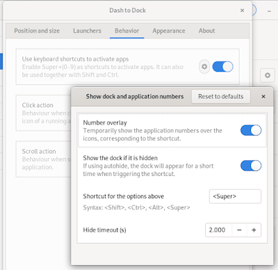
- Reset to defaults
- Number overlay: ON|OFF
- Show the dock if it is hidden: ON|OFF
- Shortcut for the options above: <Shift>|<Super>|<Ctrl>|<Alt>
- Hide timeout (s): 0.0-10.0
This settings dialog clearly wants to help you disable the number instead if you only want the shortcut key functionality. You can also switch the key from Super to Alt for example. This is another difference as we cannot change the Super key on Unity.
(*) Click action
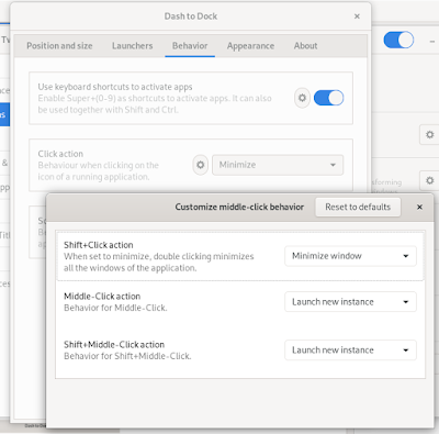
- Shift+Click action: Raise|Minimize|Launch new|Cycle through|Minimize or overview|Preview|Minimize or preview|Focus of Preview|Quit
- Middle-Click action: idem
- Shift+Middle-Click action: idem
This settings dialog gives you more control of click behaviors. It differs between Shift+Click, Middle click, and Shift+Middle click, with a lot of choices each. For users with a lot of activities involving windows, this may help, for example Click to minimize and Shift+Click to quit. They may work quicker that way.
Part IV: Appearance
Fourth part, the last part, gives you control over appearance of the dock including the theme choice, color, and opacity. And this part is the one to help you mimic Unity panel completely on GNOME. Just see the third option below.
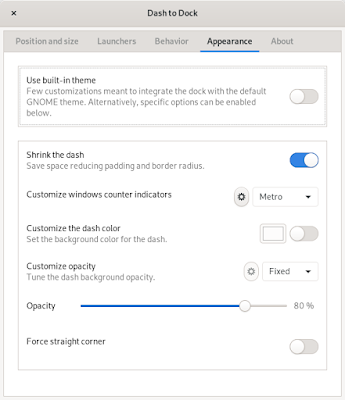
- Use built-in theme: ON|OFF
- Shrink the dash: ON|OFF
- Customize windows counter indicators(*): Default|Dots|Squares|Dashes|Segmented|Solid|Ciliora|Metro
- Customize the dash color: ON|OFF
- Customize opacity(*): Default|Fixed|Dynamic
- Opacity: 0%-100%
- Force straight corner: ON|OFF
I don't know if it's a bug or not, but I cannot make the (*) working from Customize opacity option.
(*) Customize windows counter indicators
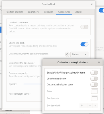
- Enable Unity7 like glossy backlit items: ON|OFF
- Use dominant color: ON|OFF
- Customize indicator style: ON|OFF
- Color: <color_selector>
- Border color: <color_selector>
- Border width: 0-10
This settings dialog helps you to turn GNOME panel to Unity panel. You may see Part VIII below for screenshots and more details.
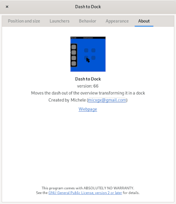
Part V: About
Fifth part of the DTD settings is information about the software itself. It's created by Michele from https://micheleg.github.io/dash-to-dock (see the website, it's simply cool). Finally it says it licensed under GNU GPLv2+ free software license. DTD may be only an extension, but this About page is professional in my personal opinion and I like it. Really good job, Michele, and big thanks to you!
Part VI: With and Without DTD
It's time to see the screenshots. Here's the comparison between GNOME vanilla without DTD and with DTD enabled.
- 1) Without DTD: no left panel showing, even when a window running
- 2) Without DTD: only if you show overview (pushing cursor to top-left corner), left panel will show
- 3) With DTD: left panel always showing
- 4) With DTD: left panel appears even though a window is maximized
These are just the basics. You still have plenty of options.
Part VII: Left Panel Appearance
Then, here are comparisons among panel size, panel position, and 'start menu' button location.
- We have choices between 16px (smallest) and 128px (largest) icon size, as icon size determines panel size.
- We can place the panel on any of left-right-top-bottom. Everything looks okay except the top one, as it covers your top panel and system tray this way.
(Full length panel on (1) left (2) right (3) bottom (4) top)
- By default it's not in full length, as the dock you see on macOS. But you can make it full just like Ubuntu 17.04-19.04 interface
((1) dock size, bottom button (2) dock size, top button (3) full size, top button (4) full size, bottom button)
By disabling Autohide, the dock (or panel if you turned it on) will not obstruct maximized window. It will be just like any normal panel on other user interfaces (e.g. KDE).
Part VIII: Experimenting
Finally, it's time to experiment. I present you 4 things here:
- Make it mimics Unity Launcher
- Color it your color
- Show numbers and run an app by Super+Number
- Let's help people with vision problems
1) Unity comes to GNOME
By enabling Unity7... option from Appearance (see Part IV above) left panel and every app launcher there look transparent and glossy. At a glance, casual user won't see any difference to Unity desktop this way. The only one missing here is the unique Unity Dash button with Ubuntu logo on its center. I hope next time DTD will come with such option.
2) Colors
By changing Customize the dash color option (see Part IV above), we can change the dock background color. By default you will see Color Palette to choose a color from. Here's my example of green, yellow, and red panels.
(Color palette dialog with nice color choices)
3) Launcher numbers
On Unity desktop, when you hold Super key, you will see every icon on panel got a number, and pressing Super+1 runs the first icon and Super+9 runs the ninth icon. That's the innovation of Unity. DTD can do that for you, simply go to Behavior and enable Use keyboard shortcuts... option (see Part III above). You may have experiment between the transparent one and the colored one like below.
4) To help disabled friends
To help people with vision difficulties, we can enlarge both left panel's icons and text on screen. Coloring the panel is also a good idea if a certain color helps them. To enlarge panel icons, simply slide Icon size limit option to the large one. To enlarge text, simply go to System Settings > Universal Access > Large Text: ON. Screenshot below is the same GNOME with full resolution with enlarged panel icons and text. You may notice the distance between clock and system tray reduced because of it.
(More visible text of folders and top panel, more visible icons on the dock)
Closing words
Dash To Dock is a really good extension. It proves that althogh GNOME 3 is by default less configurable*, but by using right extension you can make it more configurable and usable once again. You can enable normal behaviors of normal desktop once again, for instance, click app icon to raise or minimize it, or another instance, show the taskbar every time. You can also have unique and innovative features, such as Unity7 Launcher above and the ability to open app by Super+<number> key combo. Furthermore, you can have a little nostalgia in coloring the panel as you might did on GNOME 2 era prior to 2011. Finally, I wish you enjoy this article. Happy tweaking!
*) for instance, you have no right-click > Configure both on the top panel and the dock, and you can not add more panel.
This article is licensed under CC BY-SA 3.0.


