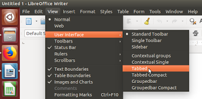
Notebookbar, the Ribbon-like user interface is more stable and usable on LibreOffice 6.1.4 and later. It is a surprise for me as I just downloaded the AppImage and run it on my Ubuntu 18.04. It's really gorgeous and you can try it now even without changing your system. It's far more better compared to the previous versions. You will see my review below with some GIF animations and examples to convince you to try it. Go ahead, try it now!
Subscribe to UbuntuBuzz Telegram Channel to get article updates directly.Read also Notebookbar on version 6.0
LibreOffice Version 6.1
This article reports the results from LibreOffice 6.1.4.2.
Install LibreOffice without changing your system
Simply download the AppImage version of LibreOffice and double-click the AppImage file. Download the "Basic" and "Fresh" option among other ones there. That way you run the program LibreOffice perfectly without removing your current version on your Ubuntu and without deleting any file on your system. And, if you worry, you can test this on a LiveCD session on Ubuntu. Go with it.
(Choose the "Download Fresh", you get the latest features)
Overview
Here's how Notebookbar looks like on Writer, Calc, and Impress. Compare this user interface to the normal Standard Toolbar below it.
(Notebookbar)
(Normal, standard toolbar)
The Notebookbar aka "Tabbed" user interface is now a lot more improved.
1. Enable the Notebookbar
Go to menu Tools > Options > Advanced > give check mark to Enable experimental features > OK > restart LibreOffice > go to menu View > User Interface > Tabbed.
("Tabbed" means the Notebookbar)
To revert back to normal toolbar, go to menu View > User Interface > Standard Toolbar. That's all.
(Reverting back to default toolbar)
2. LibreOffice Writer
On Writer, the Notebook bar shows 8 tabs namely File, Home, Insert, Layout, References, Review, View, and Tools. Notice the gear button on far right where you can switch between user interface (normal or notebookbar) quickly.
Overview:
Here's how it looks like.
Animation:
This animation shows the contents of 8 tabs of Writer while showing tooltips from a lot of buttons. You can see that the buttons now are complete and tidily arranged.
Use example, formatting page layout:
It is now in real-time, meaning, you see the changes you made immediately without pressing "Apply" button. I give you example in changing page margin and paragraph indents.
3. LibreOffice Calc
On Calc, the Notebookbar shows also 8 tabs but with some differences namely File, Home, Insert, Layout, Data, Review, View, Tools. The difference is Calc has "Data" while Writer has "References".
Overview:
In general, the contents are just the same as Writer, but with specific tables and spreadsheet features of Calc. For example, on Home tab, you see currency and number formatting buttons.
Animation:
Here's a gif animation showing those 8 tabs of Calc.
Use example, manipulating columns and rows:
This gif animation showing under Home tab there are Merge Cells and Row/Column buttons put on same place. It is easier now to add new row / column, delete them, and merge them. You can compare this to our old ones which must be opened either by combo list or menu bar.
4. LibreOffice Impress
On Impress, there are also 8 tabs but again with some differences namely File, Home, Insert, Slide, Slide Show, Review, View, and Tools. The differences are "Slide" and "Slide Show" here in place of "Layout" and "References" on Writer.
Overview:
On Home tab, generally everything is just the same, but with exceptions of "Insert Text Box" and "Shapes" buttons appearing in same place.
Animation:
Here's gif animation showing the 8 tabs of Impress.
Use example, easy switching between Master and Normal slides:
With Notebookbar, it's now really quicker and easier to switch between Normal, Slide Sorter, Notes; and Master, Master Notes, Master Handout using buttons from one place. They are located under View tab. See gif animation below.
Closing Words
Of course this is a good thing for all of us. For solely LibreOffice users, we can improve our productivity with this. For newcomers especially those from MSO 2007, this will help them a lot to get accustomed quicker than the normal toolbar. Personally, I feel this version to be better than the 5.0 or even earlier 6.0. I encourage you to test it. Enjoy!
Further Readings
There are really good resources for you to know more about Notebookbar like these. Happy testing!


